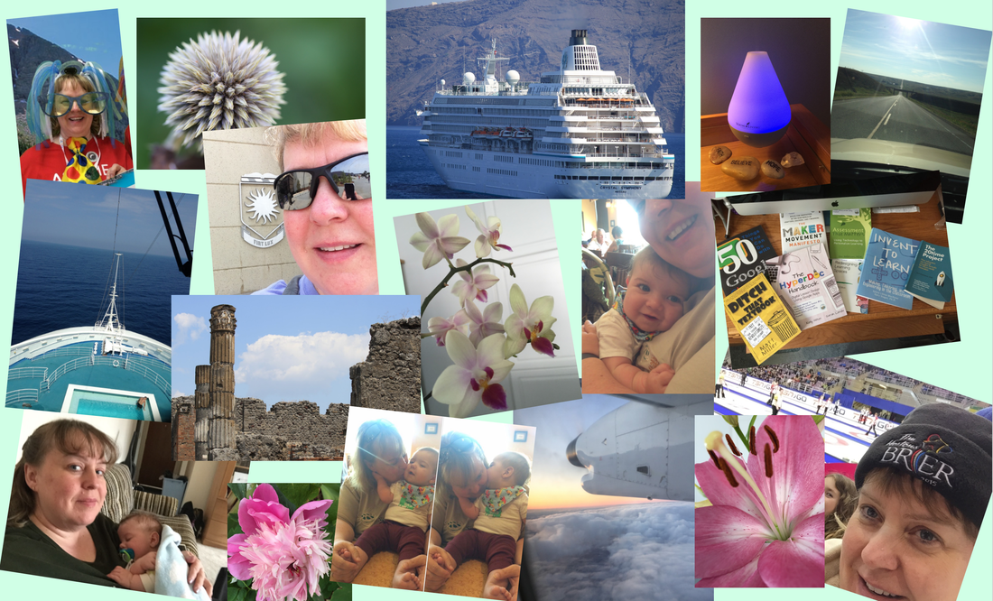
Visual Literacy
July 18 - 31, 2016
Visual Literacy has been a background thought many times. Although I used to work on it with my Grade 3's, I never made conscious effort to do so in the way I would now. I have always made the presentations I build very visual, not knowing the reason but knowing that it's what works for me and how much I hate presentations that are just slide after slide of words; I can read! Making Visual Literacy a more forefront component in teaching practice will enable me to be a better teacher all around, with students and staff.
4.2 How can pictures tell a story?After reading a few articles and watching a couple videos (the Rob Legato one was thought provoking and fun) we were asked to answer the question: Why is being visually literate important for your students?
Being visually literate means being able to deal with the world around us, visually. As Brian Kennedy stated in the second video, “90% of what we take in is visual”. This is easy to confirm when with toddlers and pre-readers in the vehicle as you drive by McDonald’s, DQ, Wal-Mart, etc. They are NOT reading, but they sure know the signs for those locations and will shout them out before you have even noticed them. They are using the visual world they live in to construct meaning in the things around them. Older kids and teenagers love graphic novels and comic books, but these definitely require different skills than just reading a text-based book. A skill set that for some must be taught. I believe in school we downplay this skill and don’t focus on the visualness of our world. In a recent webinar that I attended for the online tool easel.ly there was a lot of discussion on infographics in the world around us and teaching students to not only create them (the high level skills required to do so) but being able to interpret them. If so much of our world is visual, it is important that we make sure our students are able to use this information effectively, and are able to create it as well. 4.4 Picture ResumeWhen asked to create a resume for myself using only pictures, this is my doing.
Excellent Visual Literacy Resources from the CourseVisual Literacy for Improved Presentation (summary research)
Five Principles for Choosing and Using Typefaces Color: Hue, Saturation, Value Breaking Down an Image Paper Leaf: Color Theory Poster and Elements of Design Sheet 4.6 Connecting Globally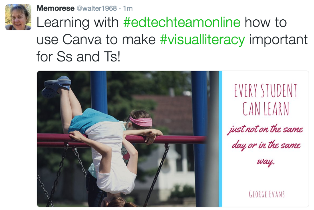
I've been introduced to Canva before, but just in passing and therefore I never did actually use it. Learned a lot today about it and was able to put some of my design principals to use. Pulled the blue from the student's shorts to the dividing line between; the font colour matches the bar the students are leaning on; matched a tall/bold font with a script font. My quote is related to 'Student Agency' and something I feel strongly about when it relates to not only students but all learners. 4.9 Digital Citizenship and Visual Literacy
|
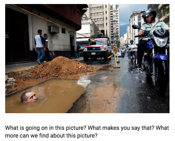
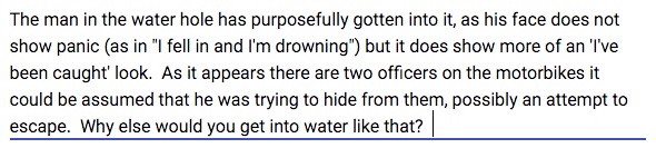
4.3 Visual Thinking StrategyThinking visually we were asked to look at an image and say what was going on in the picture. To me the image (below) told me the following:
4.5 How can visual literacy enhance the learning in your classroom?What are some design principles you can either teach to your students or use in the creation of your lessons?
I think teaching students about design principles is important. It is definitely something that doesn't come naturally to most! When I taught computers to grades 7 and 8 I had them build websites where they not only learned html before learning DreamWeaver (back in 2001-2005) but where everything they did during the year was a component of the final product. As we went through the process we would cover colour, font, size and space. I never started there, as I intentionally wanted them to make some 'big' mistakes. Once they had a few basics of website building under their belts is when we had the colour, font, size, and space discussions. This was always started by showing them some horrible websites (not theirs yet... hehe) and we would talk about what was wrong with them. It was neat to watch them then go and rework some of their pages based on what they had seen and learned. By year's end their pages looked much more professional and were much easier to read. When I taught grade 3, much more recently, we did PowerPoint and Google Slide presentations. I didn't let them fail forward. They were required to choose only one (readable) font but were allowed to alter the size. They had to choose one theme or background colour. They were only allowed two different transitions. This was for my sanity after all those years of horrible junior high websites. Now I realize that I could have been more purposeful with the grade 3s and let them in on the 'why' of my decision. I also realize that I dropped the ball and could've carried this over to posters we built in the classroom and other 'paper' products as well. Now, as an Education Technologist, I feel that I consider the design principles in my websites and presentations. I'm sure I could be even better, and now that I have some great resources for reference, I intend to do so. I see that being more mindful and purposeful will help not only me but those that I work with. 4.7 Social Media and Visual LiteracyI like this... from Using Social Media to Teach Visual Literacy in the 21st-Century Classroom. "So, what does visual literacy in the classroom look like? If we were to answer this question from our students' points of view, we would likely say Instagram, Emoji and memes."
The article 10 Surprising Ways to Use Instagram in the Classroom was a good read. I like #4 and #6 best! Check them out. 4.8 Codes in MediaWe were asked to watch a video called "The Key to Media's Hidden Codes". While watching it I took the following notes.
Technical Codes are made up of: - symbolic, written, and technical jr codes -- symbolic codes are made up of color, object, animals - the representation of things -- written codes are made up of things about you, buzz words, catch phrase - these trigger responses and become a part of everyday speech/phrases -- technical jr codes are made up of camera angles, framing, lighting - what we see or don't see Codes are there to make us 'feel'! To be fun, interesting, making you feel a certain way, engage us, create understanding, subconsciously and consciously, to bring about word of mouth (phrase, product, video, movie, etc) |
4.10 Final Project (Infographic)
As I work with teachers and students on Google Classroom, one of the things that comes up again and again is teachers looking for an overview of what Google Classroom is, and how it works. This lead me to creating a graphic as my final project that can help them with this understanding.
I started with a brown/tan background as brown is grounding. Next, the Google Classroom logo was the most important element to work with, I wanted it to 'fit' in with the other parts and not be a logo in the corner. So, from the Google Classroom logo I used the extension "ColorPick Eyedropper" to select the darker of the greens and the yellow colour codes. It interests me that Google chose these colours; green (go, easy, nature, safety) and yellow (youth, happy).
I considered a pathway or circle type of flowchart format but wanted to have the 'teacher' vs 'student' components as the highlight so I went with a column style. I'm still not happy with the arrows in the middle but don't know what else to do. I tried placing the dots as 'bullets' before each component on each side, but the graphic felt like it was tipping to the left.
When choosing fonts I wanted the 'teacher' vs 'student' comparison component as well. Both the Geneva and the Impact fonts are considered Realist Sans-Serif fonts, but by choosing them to have a different feel it creates a dominant / non-dominant feel. I wanted the student font to be the more dominant one as the teacher is not the centre of the classroom, the student is!
In my original design I had the word 'Workflow' in the title, but the more I looked at the content and the 'tips' at the bottom, the more that word felt out of place. The infographic is more than just a workflow chart, so I removed the extra word. As I continued to look at and come back to view the visual the more the images on the sides bothered me and made the graphic feel cluttered, so I made a version of it without the visuals. I liked the cleaner look better, but felt the images supported the concepts and that it was missing the full impact and usefulness without them. Conflicted!
When creating the tip about Google Calendar, at first I had it as just a student feature because of how powerful it can be to help students be organized, and therefore I placed it in the student font and colour, but as I thought about how useful that tool is for teachers too I decided that it had to be a teacher tip too. So without changing the font I decided that placing the green dot on top of the yellow dot would indicate that it applied to both, and then I changed the wording of the tip slightly to match the bringing together of the dots. This felt right and I liked the overlapping dots, so I recreated them and made them larger for the top-right corner that previously had a flow circle image that seemed out of place. I feel this brought the infographic together and added a finishing touch.
Other than that, I feel the Infographic will be useful to teachers, especially those new to Google Classroom! It sums some of the key features concisely and provides a workflow feel as well.
** After Google Hangout with Tracy... (thank you @trapurdy!)
- I am leaving the side images, as she agreed that taking them away took away some of the power of the Infographic.
- I played with the arrows, turned them into a zigzag, and then turned them back again... changed the colour to a medium grey and they are less offensive! Sticking with the grey arrows.
My video script is similar to the above explanation. It is available at:
https://docs.google.com/document/d/1gMM-OF00gL_3LqM9p1XZOqQmV0JijesW28OuLk9k_ZI/edit?usp=sharing
4.10 Final Project (Video Summary)
|
|
4.12 Final Reflections
How does Visual Literacy fit in with Global Collaboration, Project Based Learning and Flipped Learning?
Can Visual Literacy enhance the learning in your classroom? How?
Since everything around us is visual, Visual Literacy fits into all areas of not only these courses (Global Collaboration, Project Based Learning, and Flipped Learning) but into life. It fits into Global Collaboration because it can take away language barriers and allow people all over the world to get the same 'picture' of a topic or concept. I always knew IKEA was onto something with their pictures only directions! In Project Based Learning, Visual Literacy is important because it if students are going to do complete projects that entail components such as marketing plans, sales, as well as their pitches, they will need to be able to sway and engage by bringing visuals and emotions into their presentations. When watching all the great TEDtalks, it's not a person standing in front of a bunch of words that has the impact. Due to the nature of Flipped Learning and the video components it is vital that the images and visuals be not only engaging but informative and clear; they need to portray meaning in a way that gets across the learning objectives of the video.
In the classroom it is important to assure that the visuals being provided represent the meaning that we, as teachers, wish to portray. The visuals will engage our learners and have purpose and meaning towards the objectives. Teaching the students to interpret the visuals presented is important too, in that if they are passing them over and/or not looking deeply they will not be gaining the full meaning. Intentional use and teaching of Visual Literacy is a vital component of our world and our classrooms today.
|
|